
Each year the trend of responsive web design becomes different to the previous year. Consumers can expect an experience that is personalised as technology progresses.
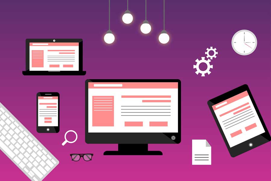
Responsive web design as a term has been around for some time now. If you have not heard the term, it describes website creation that functions and adapts correctly to all kinds of devices – tablets, phones, desktops etc. The practice should evolve just as the technology does.
Five very relevant responsive principals and design practices to consider are covered below.
1. Mico Interactions – New Trend!
A recent trend is the use of micro interactions. Web design writers have noticed this as one of the most common things evolving since last year.
These are variables allowing users to interact with a page without the need to reload it. A good example of micro interaction is seen on Facebook where ‘likes’ now have an option added so ‘reactions’ can be made to a post. Emotions can be indicated toward the content in a post by reacting with a smiley face, a heart, a sad face etc. The page stays the same because it doesn’t reload.
Because the page doesn’t reload, micro interactions make the UX (user experience) a lot more fun while also saving time. It is expected these interactions will become very popular in the near future.
2. Typography – the Smart Type
In addition to page aspects typically designed for responsiveness, it is commonly overlooked that you can create a typeface responsively. An example would be using Verdana 24 pt for headers and a smaller type of Arial for a mobile version of the page.
Some fonts are designed to be large making them less effective when used on a mobile page. This trend makes it crucial to the user experience that titles and text are set up using different fonts and sizes depending on the device being used.
3. Mobile Knowledge
These days, the majority of web traffic is coming from mobile devices. make a need for the concepts of websites and apps to be separated in your mind as having a responsive app is different having a responsive website. App user experience and usage is important and while there are many similarities for a mobile site to focus on, there are also some semantics a responsive web design can’t deal with.
While the number of possible screen sizes to be used is a consideration for both, A/B testing for each will be different for example.
4. The Grid Innovations
Innovating your grid layouts keeps a website differentiated from other sites while remaining aesthetically pleasing. This trend will grab people’s attention from the use of grid designs like the 12 unit grids, rule of thirds etc by using column combinations that are not so common or playing with the CSS and whitespace for new page organsation.
5. The Colour Wheel Vibe Trend
Elegant Themes design writers agree that current web design tools will allow us to experiment with vibrant colors next. Tools like Material Design and Flat Design 2.0 have made advancements and suggest gradients with vibrant colours as something to take advantage of going forward.
The more technically advanced our mobile devices become, the better vibrant color trends translate well with complex visual designs with less a divide between content quality displayed on those devices compared to desktop display. This is how the semantics of colour has even become responsive in design.